

How to build an intuitive debit card form with React Hooks & Styled Components


Hi, in today's blog post we'll be building this:
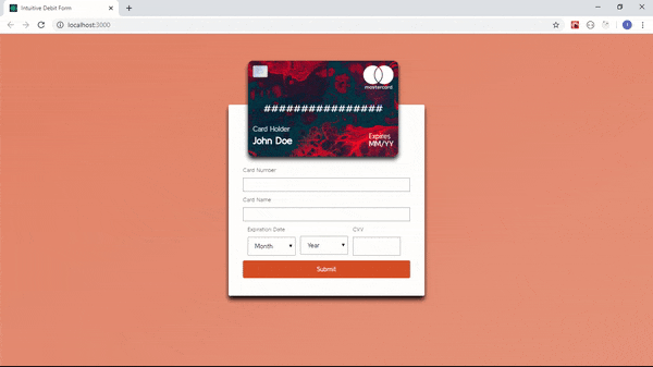
An intuitive debit card form. As you can see, it autofills as we type and most importantly the card flips to the back!! This is a really fun one to build and today we'll be using React (Create React App) and Styled Components. I'll also leave links to relevant articles for further reading and understanding.
What are Styled Components and how do we write them?
Well I won't bore you with the technical jargons but Styled Components are basically a CSS-In-JS library that allows you leverage the power of JavaScript (template literals to be exact) and CSS. I know it sounds daunting but it's very easy to write. here's an example button with Styled Components
import styled from 'styled-components';
export const Button = styled.button`
border: none;
padding: 10px 30px;
background-color: #e3e3e3;
color: #000;
border-radius: 3px;
`;
and in a component that would need a button you would simply go:
<Button> My Button </Button>
that's it. At it's core it still is regular HTML Elements.
Starter Project and To-Knows
I've written starter code for this project so you don't have to go through the chore, simply headover to Starter Project and clone the repo.
To install dependencies run either npm install or yarn.
You will notice there's a .env file that file contains some code that helps circumvent a problem I keep running into with CRA about Webpack. It's an annoying little bug you might have run into so this sorts it out.
If you look through the source directory in the project you should have a structure that looks like this:
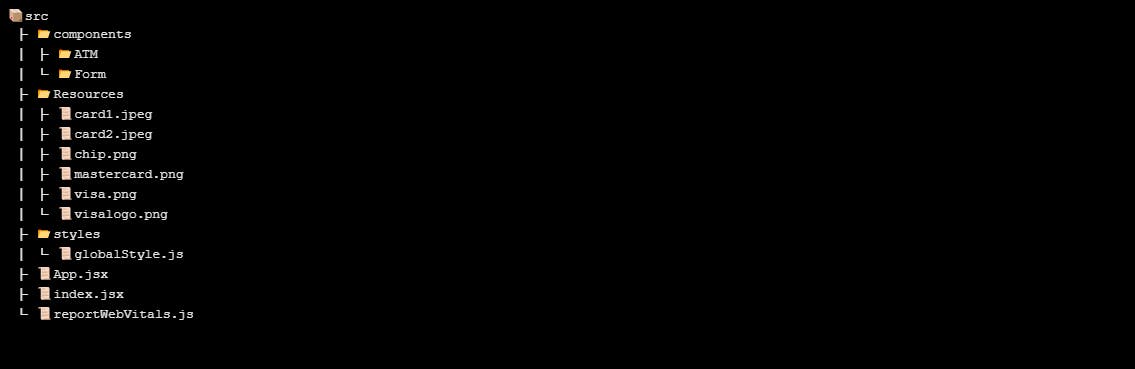
A few things to note is GlobalStyle.js in the styles directory. As the name suggests, it holds global styles for the application much like index.css or app.css would.
Another minor thing to note is in the index.html file there's a couple links to Google font styles, feel free to swap them out if you don't want.
Also I want to explain why the font size is globally set to 62.5%. The reason is because this allows one rem unit to be equals 10 pixels as opposed to 16px which is default i.e.
1rem === 10px
Lastly let's talk about these few lines of code in :root{}:
--color-white-rgb: 255,255,255;
--color-black-rgb: 0, 0, 0;
--color-black: #000;
--color-black-dark: rgba(var(--color-black-rgb), 0.9);
--color-white-dark: rgba(var(--color-white-rgb), 0.8);
First off, :root{} allows us define CSS variables to use everywhere instead of repeating values. Think of it as the DRY principle but for CSS. You'll be used to this concept if you've ever written SASS.
Now onto those lines of code. RGBA does not allow you to pass a function which is basically how we use CSS variables, you would be tempted, especially if you've written SASS which allows syntax like
rgba($color-black, 0.7). It won't work unfortunately.
What RGBA does allow is a variable function whose variable is the RGB code, which is exactly what we do.
Let's Write Some Code 😁
Now that we've gotten all that out of the way, let's start with the form.
Create a file in the form folder called form.style.js and copy the code i'll explain in a minute
import styled from 'styled-components';
export const IntuitiveAtmParent = styled.div`
  background-image: linear-gradient(
    to bottom right,
    var(--color-primary),
    var(--color-primary)
  );
  position: relative;
  background-size: cover;
  height: 100vh;
  overflow: hidden;
`;
export const IntuitiveAtmCardParent = styled.div`
  position: relative;
  top: 8%;
  left: 13%;
`;
export const IntuitiveAtmForm = styled.form`
  position: absolute;
  top: 50%;
  left: 50%;
  transform: translate(-50%, -50%);
  width: 30%;
  height: 40rem;
  padding: 1rem 3rem;
  border-radius: 3px;
  background-color: var(--color-white);
  box-shadow: 0 0.8rem 0.9rem var(--color-black-dark);
`;
export const IntuitiveAtmFormSpan = styled.span`
  color: var(--color-black);
  font-size: 1.2rem;
  text-align: left;
`;
export const IntuitiveAtmCardDetailsBlock = styled.div`
  display: flex;
`;
export const IntuitiveAtmCardDetailsBlocks = styled.div`
  margin-left: 1rem;
`;
export const Button = styled.button`
  font-family: inherit;
  width: 100%;
  text-align: center;
  padding: 1rem 2rem;
  border-radius: 3px;
  color: var(--color-white);
  background-color: var(--color-primary);
  border: none;
  margin: 1rem 0;
`;
export const CVVInput = styled.input`
  width: 10rem;
  font-family: inherit;
  margin-top: 1rem;
  padding: 1rem;
`;
export const Input = styled.input`
  width: 100%;
  font-family: inherit;
  margin-top: 1rem;
  padding: 0.5rem;
`;
export const Select = styled.select`
  font-family: inherit;
  margin-top: 1rem;
  padding: 1rem;
  width: 10rem;
`;
export const Option = styled.option``;
export const PadDown = styled.div`
  margin-top: 12rem;
`;
export const MarginUtilityContainer = styled.div`
  margin: 1rem 0 1rem 0;
`;
Let's dig in shall we ?
IntuitiveATMParentis basically the parentdivwe make the background orange using this linear gradient.IntuitiveAtmCardParentis the parent of the ATM component we'll write in a minute. Feel free to play around with the values to get it exactly centered or to your preference.PadDownis basically a utility div that puts a little bit of distance between two elements. The rest is pretty straightforward, we style the form centering it and style form elements we'll use selects, inputs etc.
Now it's time to use the components, add form logic etc create a file named intuitive-form.jsx (or whatever you like really) and paste the following code:
import React, { useState } from 'react';
// import Atm from '../ATM/atm-background';
import {
IntuitiveAtmParent,
IntuitiveAtmCardParent,
PadDown,
MarginUtilityContainer,
IntuitiveAtmFormSpan,
Input,
IntuitiveAtmCardDetailsBlock,
IntuitiveAtmCardDetailsBlocks,
Select,
Option,
CVVInput,
Button,
IntuitiveAtmForm,
} from './form.style';
const IntuitiveForm = () => {
const months = [
'January',
'February',
'March',
'April',
'May',
'June',
'July',
'August',
'September',
'October',
'November',
'December',
];
const years = [
'2020',
'2021',
'2022',
'2023',
'2024',
'2025',
'2026',
'2027',
'2028',
'2029',
'2030',
];
const [cardNo, setCardNo] = useState('');
const [cardName, setCardName] = useState('');
const [month, setMonth] = useState('');
const [year, setYear] = useState('');
const [cvv, setCvv] = useState('');
const submitHandler = (e) => {
e.preventDefault();
console.log(cardNo.length);
const data = {
cardNo,
cardName,
month,
year,
cvv,
};
console.log(data);
};
return (
<IntuitiveAtmParent>
<IntuitiveAtmCardParent>
{ /*
leave commented out because we have not built component yet
<Atm
cardNo={cardNo}
cardName={cardName}
month={month}
year={year}
cvv={cvv}
/> */
}
</IntuitiveAtmCardParent>
<IntuitiveAtmForm>
<PadDown>
<MarginUtilityContainer>
<IntuitiveAtmFormSpan>Card Number</IntuitiveAtmFormSpan>
<Input type='text' onChange={(e) => setCardNo(e.target.value)} />
</MarginUtilityContainer>
<MarginUtilityContainer>
<IntuitiveAtmFormSpan>Card Name</IntuitiveAtmFormSpan>
<Input type='text' onChange={(e) => setCardName(e.target.value)} />
</MarginUtilityContainer>
<IntuitiveAtmCardDetailsBlock>
<IntuitiveAtmCardDetailsBlocks>
<IntuitiveAtmFormSpan>Expiration Date</IntuitiveAtmFormSpan>
<Select onChange={(e) => setMonth(e.target.value)}>
<Option value=''>Month</Option>
{months.map((month) => (
<Option value={month}>{month}</Option>
))}
</Select>
</IntuitiveAtmCardDetailsBlocks>
<IntuitiveAtmCardDetailsBlocks>
<div> </div>
<Select onChange={(e) => setYear(e.target.value)}>
<Option value=''>Year</Option>
{years.map((year) => (
<Option value={year}>{year}</Option>
))}
</Select>
</IntuitiveAtmCardDetailsBlocks>
<IntuitiveAtmCardDetailsBlocks>
<IntuitiveAtmFormSpan>CVV</IntuitiveAtmFormSpan>
<CVVInput onChange={(e) => setCvv(e.target.value)} />
</IntuitiveAtmCardDetailsBlocks>
</IntuitiveAtmCardDetailsBlock>
<Button type='submit'>Submit</Button>
</PadDown>
</IntuitiveAtmForm>
</IntuitiveAtmParent>
);
};
export default IntuitiveForm;
First we create variables which hold the names of Months and a couple of years into the future.
Then we create pieces of state via the useState hook to handle all relevant form data:
- Card Number
- Card Name (Owner)
- CVV
- Month
- Year
We also have a submitHandler form which just logs the data to the console when we hit submit.
Next and very important is how we arrange the components which I feel is pretty straightforward.
IntuitiveAtmParent houses every component, IntuitiveAtmCardParent houses the ATM component we're yet to build.
Underneath is the form which the PadDown component houses the form elements.
Form elements are housed by MarginUtilityContainer which is an element which adds margin on top and bottom. And then we just have the form elements inside. Every related form element is housed in the utility component.
Only other thing of note is onChange we're setting e.target.value to state.
Let's build the ATM 🥁
Finally let's build the actual ATM. In the ATM directory, create a file named atm.style.js and paste the following code:
import styled, { css } from 'styled-components';
import atmBackground from '../../resources/card2.jpeg';
export const ATMBackground = styled.div`
  perspective: 120rem;
  position: relative;
  z-index: 700;
  box-shadow: 0 0.6rem 0.9rem var(--color-black-dark);
`;
export const FrontofCard = styled.div`
  /* general card styling*/
  height: 20rem;
  color: var(--color-white);
  font-size: 2rem;
  position: absolute;
  backface-visibility: hidden;
  top: 0;
  left: 25%;
  width: 100%;
  box-shadow: 0 0.6rem 0.9rem var(--color-black-dark);
  transition: all 1s;
  /* front of card specific styling*/
  background-image: url(${atmBackground});
  width: 23%;
  border-radius: 1rem;
  ${(props) =>
    props.rotate
      ? css`
          & {
            transform: rotateY(-180deg);
          }
        `
      : css`
          & {
            transform: rotateY(0);
          }
        `}
`;
export const BackofCard = styled.div`
  height: 20rem;
  color: var(--color-white);
  font-size: 2rem;
  position: absolute;
  backface-visibility: hidden;
  top: 0;
  left: 25%;
  width: 100%;
  box-shadow: 0 0.6rem 0.9rem var(--color-black-dark);
  transition: all 1s;
  /* back of card specific styling*/
  background-image: url(${atmBackground});
  width: 23%;
  border-radius: 1rem;
  ${(props) =>
    props.rotate
      ? css`
          & {
            transform: rotateY(0);
          }
        `
      : css`
          & {
            transform: rotateY(180deg);
          }
        `}
`;
export const ATMChip = styled.img`
  width: 10%;
  position: absolute;
  top: 1rem;
  left: 1rem;
`;
export const ATMProvider = styled.img`
  width: 20%;
  position: absolute;
  top: 1rem;
  right: 1rem;
`;
export const ATMDigits = styled.p`
  position: absolute;
  top: 50%;
  left: 50%;
  transform: translate(-50%, -50%);
`;
export const ATMHolder = styled.div`
  font-size: 1.5rem;
  position: absolute;
  top: 13rem;
  left: 1rem;
  font-weight: 100;
`;
export const ATMHolderTitle = styled.span`
  display: block;
  margin: 0.5rem 0;
  color: var(--color-white-dark);
`;
export const ATMHolderName = styled.span`
  display: block;
  margin: 0.5rem 0;
  font-size: 2rem;
  font-weight: 700;
`;
export const ATMExpiry = styled.div`
  font-size: 1.5rem;
  position: absolute;
  top: 15rem;
  right: 1rem;
  font-weight: 100;
`;
export const ATMExpiryTitle = styled.span`
  display: block;
  color: rgba($color-white, 0.8);
`;
export const ATMExpiryDetailsMonth = styled.span``;
export const ATMExpiryDetailsYear = styled.span``;

export const ATMCVV = styled.p`
  border-radius: 3px;
  border: 1px solid var(--color-white);
  width: 80%;
  background-color: var(--color-white);
  padding: 0.5rem;
  text-align: right;
  color: var(--color-black);
  position: absolute;
  top: 50%;
  left: 50%;
  transform: translate(-50%, -50%);
`;
There's quite a lot going on here so let's dig in and understand the logic behind it.
So basically you have a parent component / element, a div with two children the front of the card you see and the back of the which you don't see. Think of your ATM the part that faces you with your name etc and the back with your CVV.
The parent needs to be relatively positioned so the children can be placed absolutely on one another. The parent also has this property perspective which is set to 120rem so 1200px which is the sweet spot. How I understand perspective is it ensures when the card rotates it doesn't look iffy or janky.
Another absolutely critical property to how this works is backface-visibility and the best way to think about it is this:
Imagine you had two elements absolutely positioned on each other but say the element behind is bigger it would obviously creep out well with this property it's effectively saying "hey, I don't want to ever see what's behind the first element", "hide the back" so to speak.
This is CRUCIAL because the idea is you don't want the front of the card overlapping the back or vice versa.
So once you understand that we leverage the power of Styled Components which let us write dynamic CSS which relies on props. If a rotate prop is passed onto either FrontofCard or BackofCard we then rotate either card depending.
Take for instance in the BackofCard component:
 ${(props) =>
    props.rotate
      ? css`
          & {
            transform: rotateY(0);
          }
        `
      : css`
          & {
            transform: rotateY(180deg);
          }
        `}
we say "if there is a rotate prop, set the origin along the Y axis to 0. Else, and the user does not want to flip the card set the origin to 180 degrees". By rotating it 180 degrees initally we ensure the back of the card is rotated backwards so the speak, counter-clockwise to be exact and backface-visibility takes care of hiding it.
Another way to explain it is origin 0 is directly facing you, if you rotate something clockwise or counter-clockwise 180 degrees it is no longer facing you but facing backwards on either side.
I understand that it's a lot to understand but the logic is critical to how the card rotates. The rest of the styling is specific to typical elements on a debit card and positioning them:
- Magnetic Chip
- Card Type i.e. Visa or Mastercard
- Expiry Month
- Expiry Year
- Card Holder's Name
- Card Number
It's also important to know, if you haven't inferred that css let's us write css code and &{} let's us target the element itself.
Whew! Now let's build the actual component that will use these components. Create a file named atm-background.jsx and paste the following code:
import React from 'react';
import chip from '../../resources/chip.png';
import mastercard from '../../resources/mastercard.png';
import visa from '../../resources/visa.png';
import {
ATMCVV,
ATMExpiryDetailsYear,
ATMExpiryDetailsMonth,
ATMExpiryTitle,
ATMExpiry,
ATMHolderName,
ATMHolderTitle,
ATMHolder,
ATMDigits,
ATMProvider,
ATMChip,
BackofCard,
FrontofCard,
ATMBackground,
} from './atm.style';
const atm = ({ cvv, cardName, month, year, cardNo }) => {
// ATM GOES HERE
return (
<ATMBackground>
<FrontofCard rotate={cvv.length >= 1}>
<ATMChip src={chip} alt='Debit card chip' />
{!!cardNo && cardNo[0] === '4' ? (
<ATMProvider src={visa} alt='Visa Logo' />
) : (
<ATMProvider src={mastercard} alt='Mastercard Logo' />
)}
<ATMDigits>
{cardNo.length >= 1 ? cardNo : '################'}
</ATMDigits>
<ATMHolder>
<ATMHolderTitle>Card Holder</ATMHolderTitle>
<ATMHolderName>
{cardName.length >= 1 ? cardName : 'John Doe'}
</ATMHolderName>
</ATMHolder>
<ATMExpiry>
<ATMExpiryTitle>Expires</ATMExpiryTitle>
<ATMExpiryDetailsMonth>
{month.length >= 1 ? `${month}/` : 'MM/'}
</ATMExpiryDetailsMonth>
<ATMExpiryDetailsYear>
{year.length >= 1 ? `${year}` : 'YY'}
</ATMExpiryDetailsYear>
</ATMExpiry>
</FrontofCard>
<BackofCard rotate={cvv.length >= 1}>
<ATMCVV>{cvv ? cvv : ' '}</ATMCVV>
</BackofCard>
</ATMBackground>
);
};
export default atm;
Like i explained earlier ATMBackground houses the FrontofCard and BackofCard components. Those components simply house the components relevant to each side.
Something important to note is you see a lot of ternary operators they just ensure we don't ever have a situation where we have an empty string in places, it'll always render placeholder text. A couple checks to note:
FrontofCard&BackofCardwe check if CVV prop is null and pass in the result of that check.!!operator is shortand for!==nulland we check ifcardNois not equals null and if the first element is equals to a 4 which is the start for Visa cards.
Finishing Touches
The very last thing to do is to go back to intuitive-form.jsx component and remove the two comments, save and voila you're done. Test out your form. If you're unhappy with the positioning of the card in form.style.js feel free to play with the values of IntuitiveAtmCardParent. Other than that we're done.
Ways to improve it further
We've done a lot of great work but we could still improve it further by:
- Making it responsive
- Supporting more card types other than Visa and Mastercard potentially extracting it into a function that does the if checks.
- Right now, the only way the Card flips back is if the CVV is empty you could potentially fix that hint hint it would involve
useStateanduseEffect
Feel free to take on any of these challenges.
Conclusion
We've built an absolutely amazing form and I hope this knowledge helps you in future applications. If you've got any questions or get stuck, check out the finished app in the 'Intuitive Debit Card' folder in Design Animations Repo (you'll have to clone the repo if you want to run locally). Or shoot me a DM on Twitter or find me on Github or check out my portfolio (I'm available for work).
Relevant Links: